Landscape Design 5B
PLANTING DESIGN: SISTERS OF SOCIAL SERVICE HEALING GARDENS
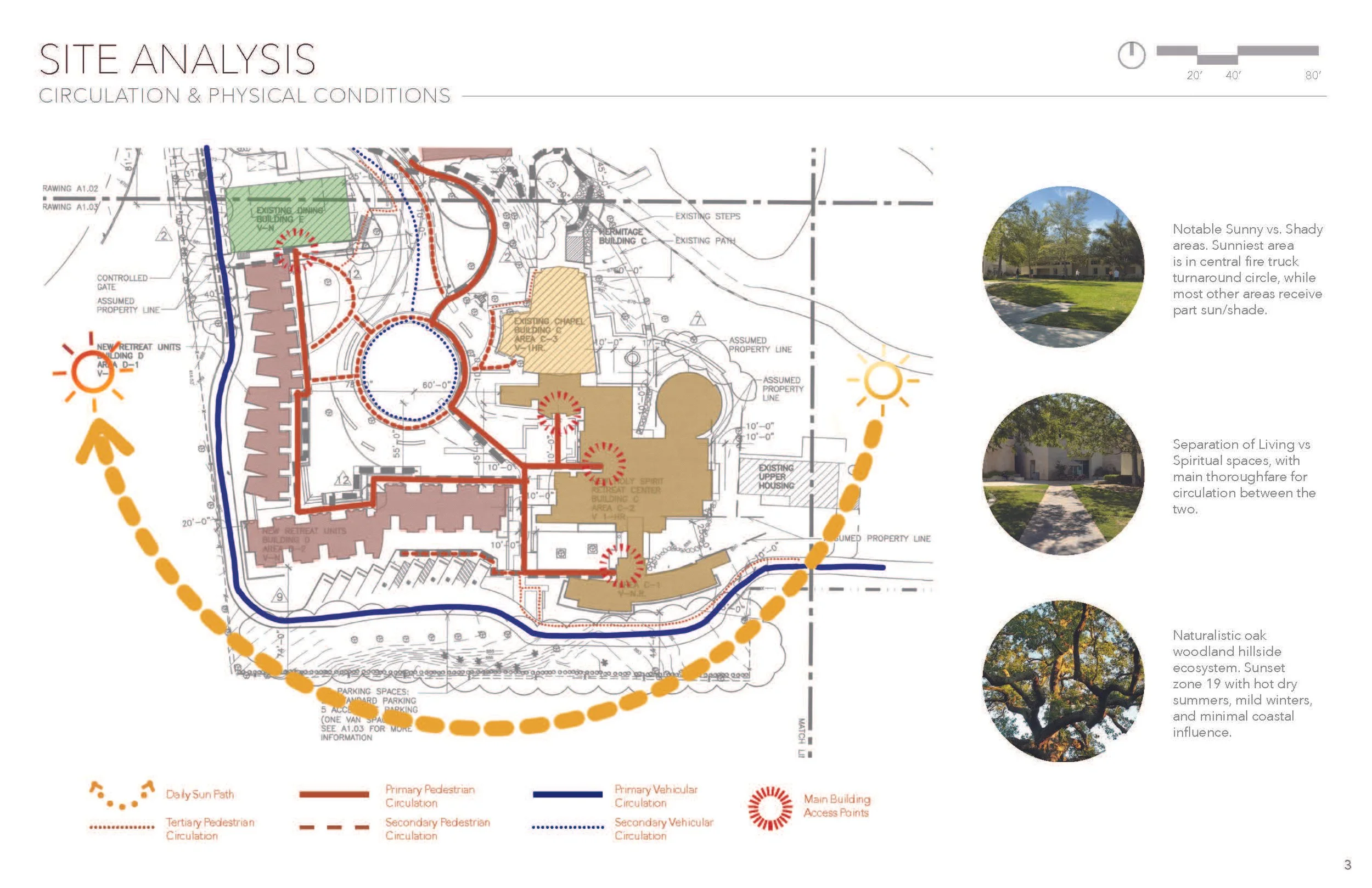
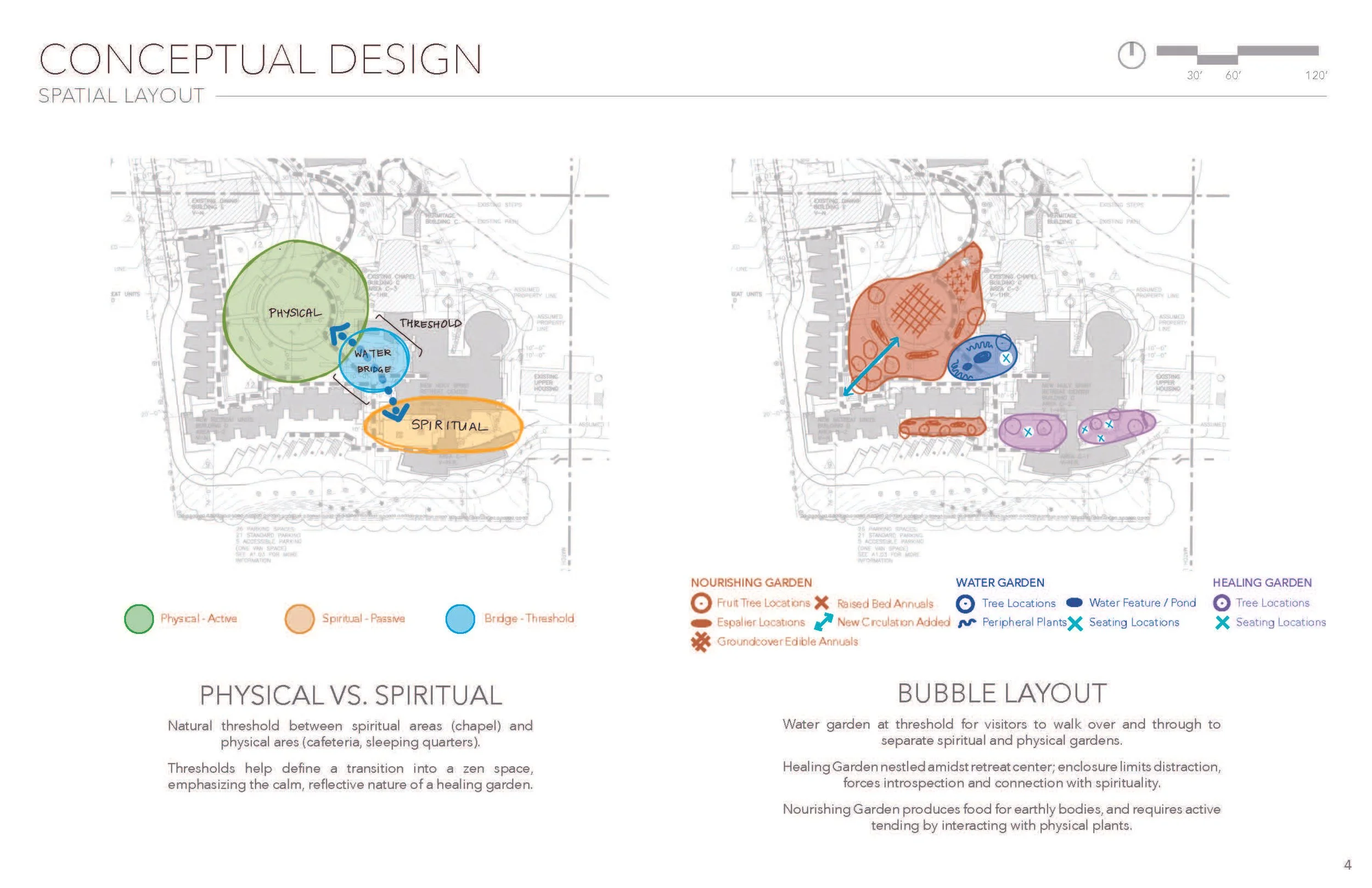
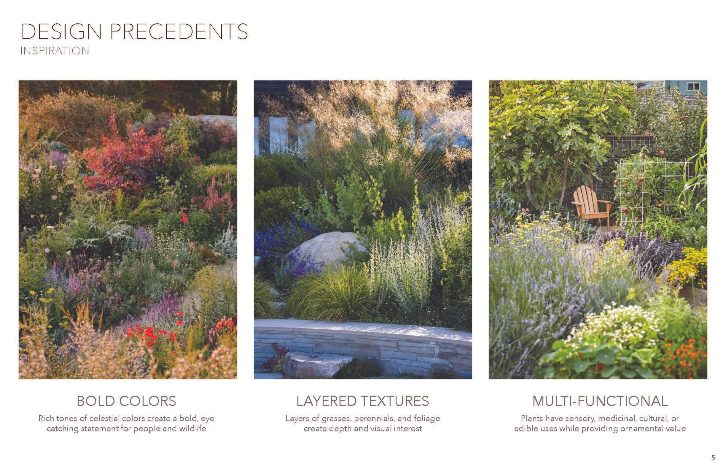
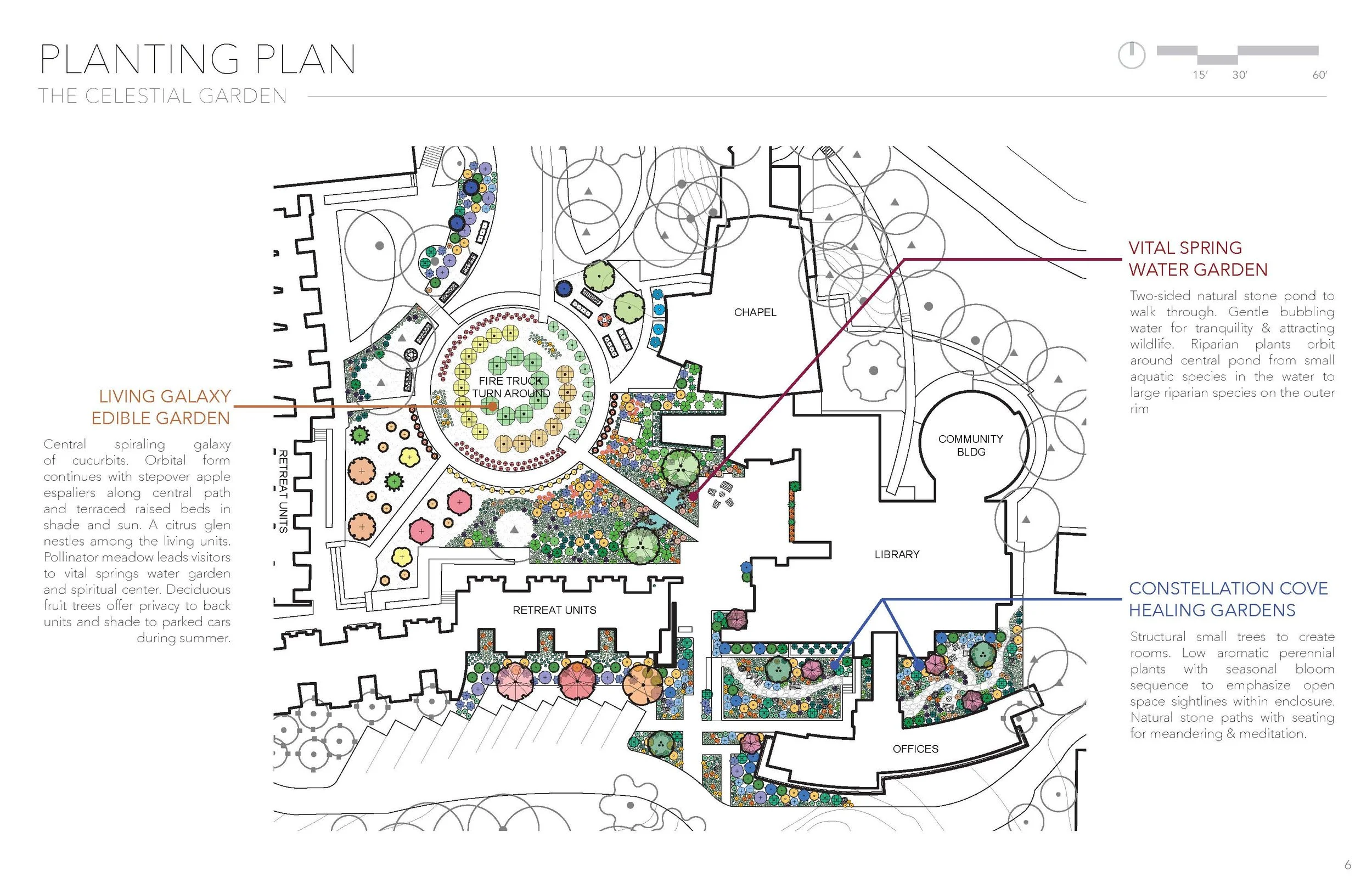
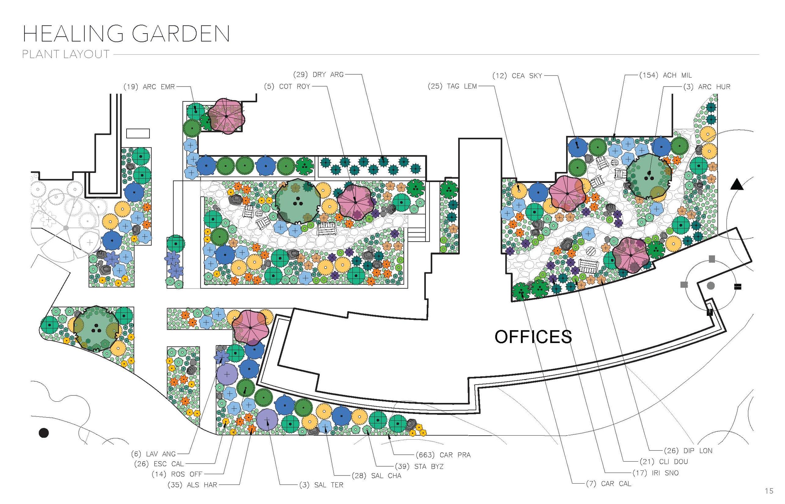
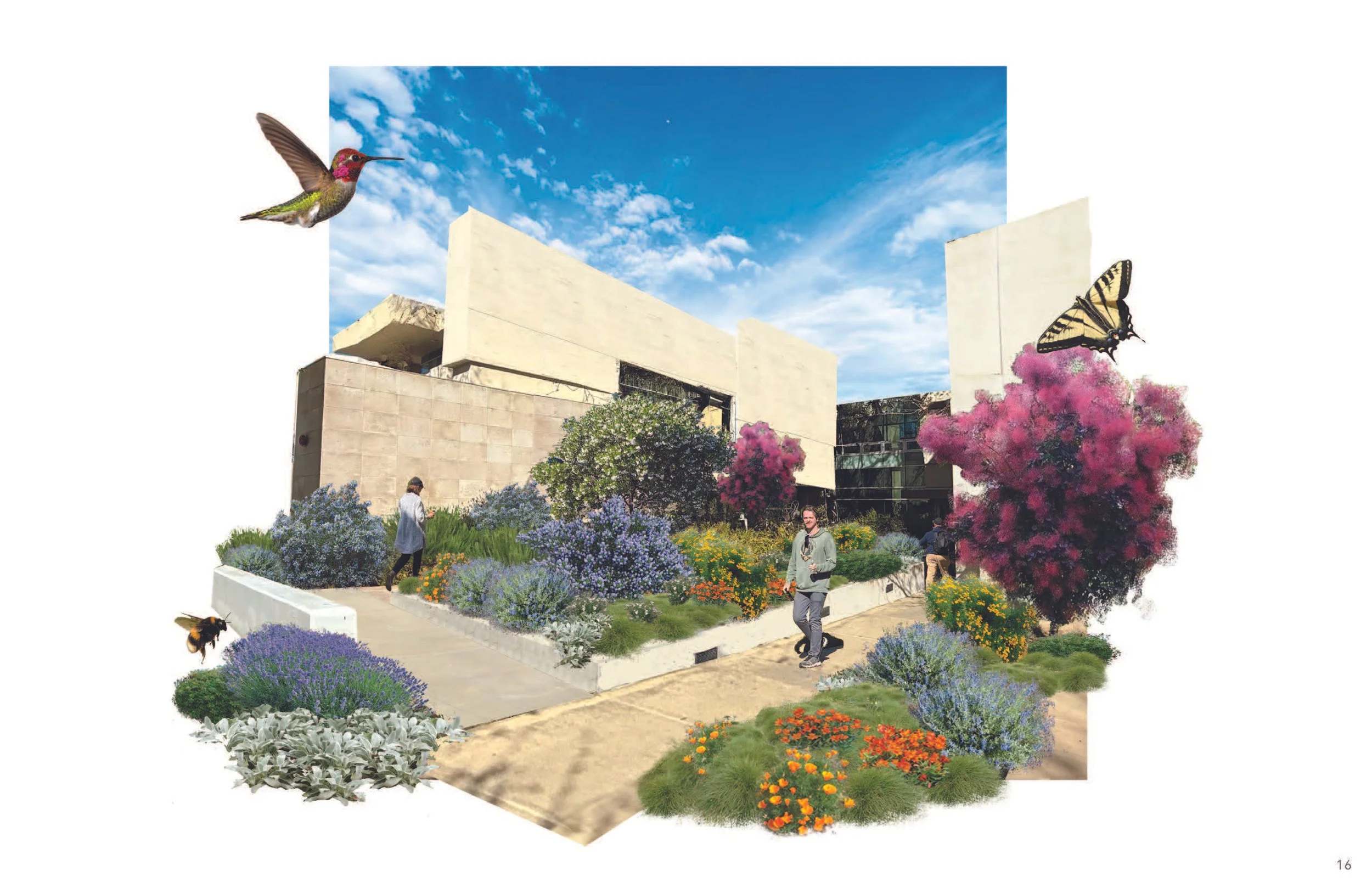
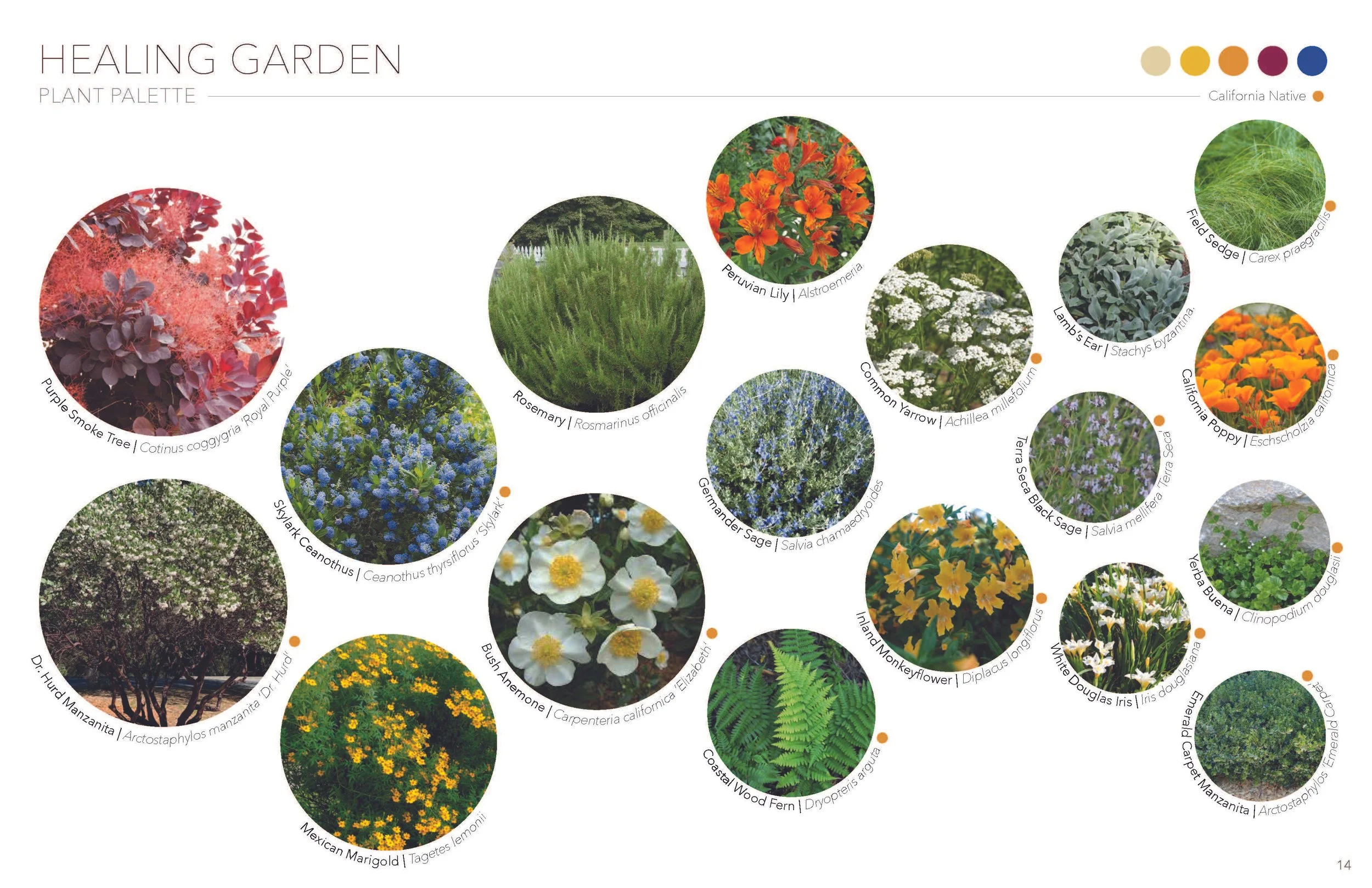
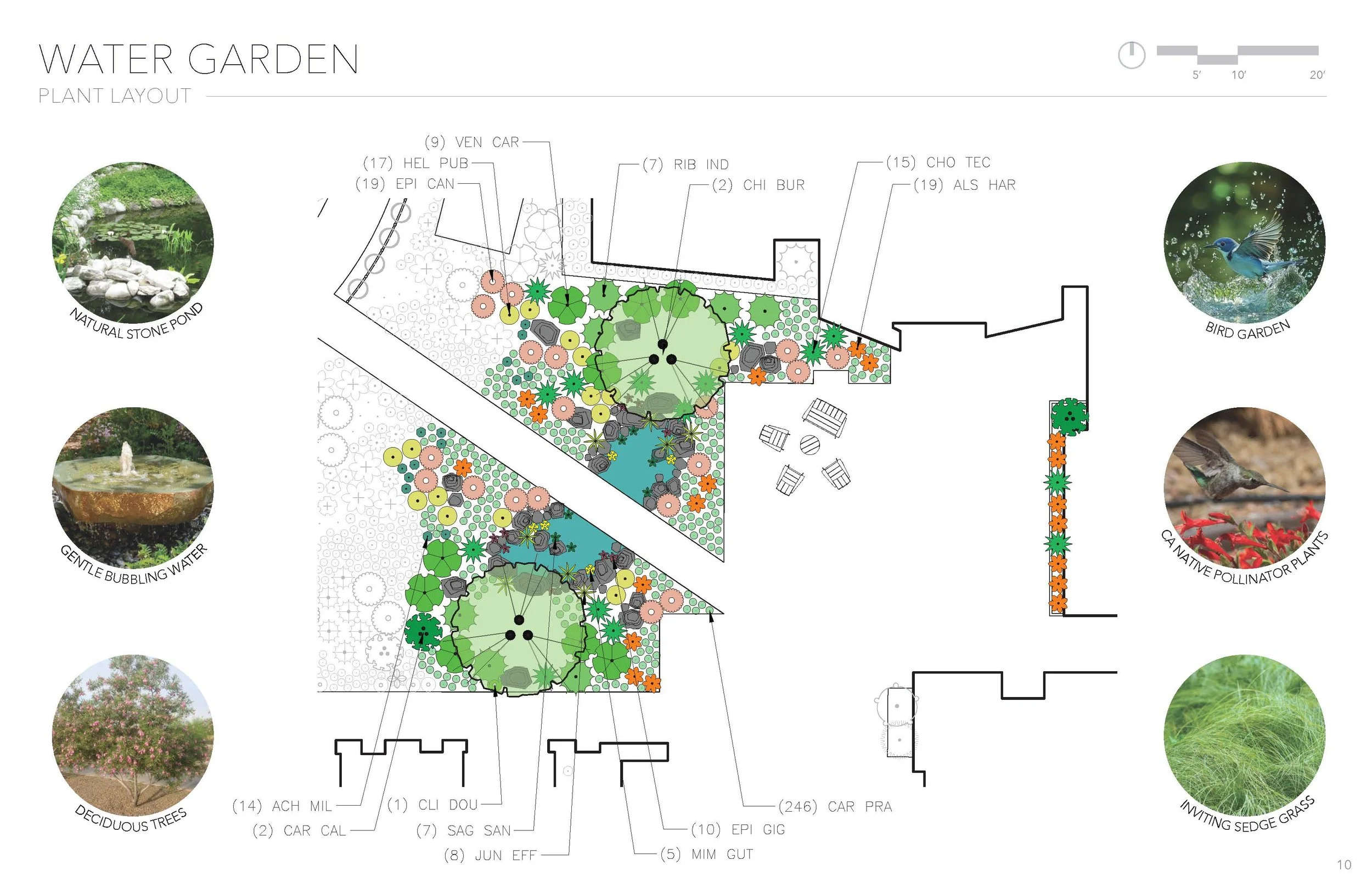
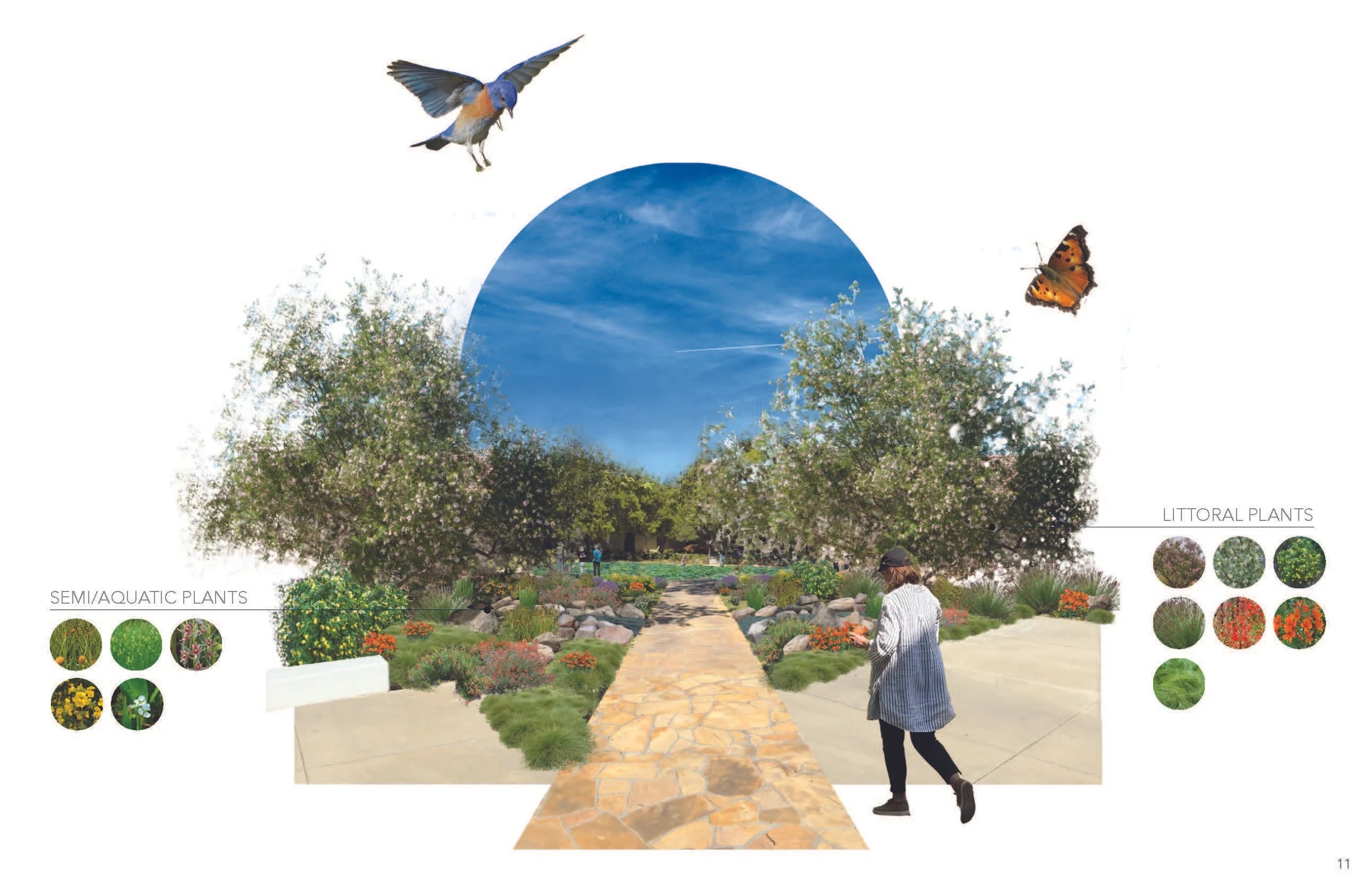
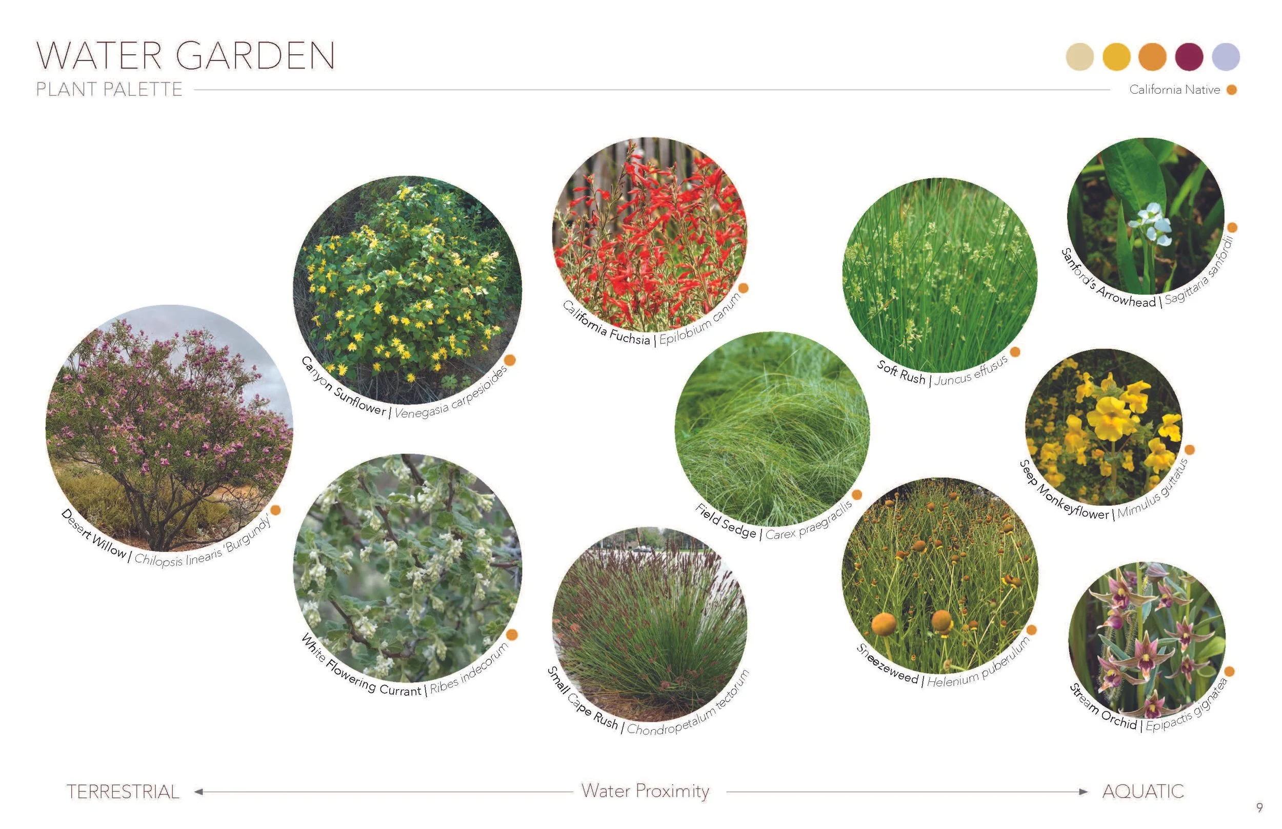
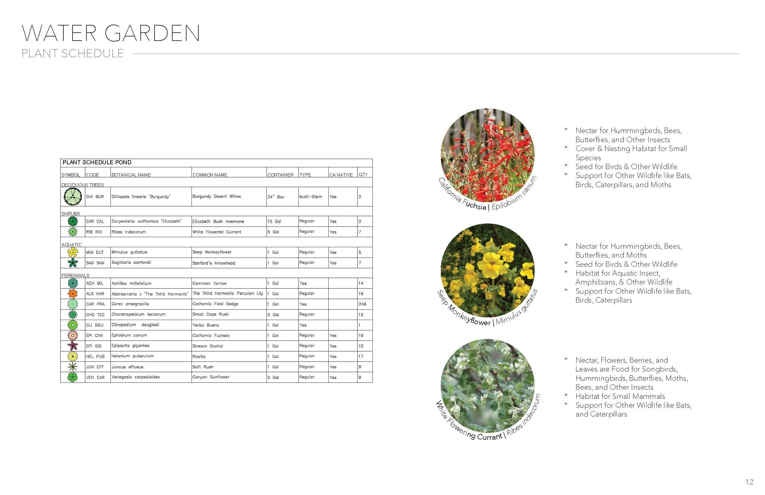
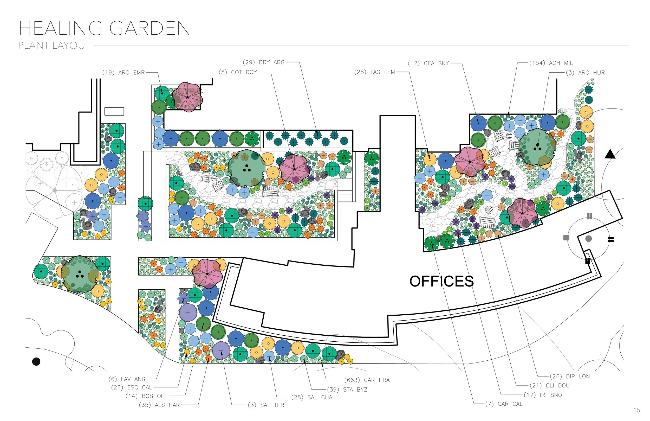
This course taught us how to select and combine plants in the landscape to create rooms, evoke emotions, appeal to the senses, provide shade or other experiential quality, create habitat and aesthetic beauty, and work with the land for environmental purposes. This second project was using the plant palette we created in our Plant Studies class on a real site, the Sisters of Social Service in Encino, CA. We were tasked with creating three different palettes and gardens: a healing garden in which all the plants had healing qualities (medicinal, edible, spiritual, cultural); a water garden in which the plants could tolerate being in our around water and supported wildlife; and an edible garden for agricultural cultivation. The site is a nondenominational spiritual center for retreats, and has full time sisters who live on site. Because the sisters are passionate about accepting all types of people and belief on the site, I was inspired by something we are all unified under: our earthly existence within this solar system. It’s incomprehensible vastness can help put individual experiences into perspective, encouraging internal acceptance and healing, a leading purpose of the site. Using the Celestial Garden as my guiding motif, I chose plants inspired by qualities of the planets: their colors, materiality, and historic cultural and spiritual associations. This class reinforced the importance of prioritizing hydrozones while selecting plants, and minimizing the quantity of species in order to make a legible and impactful design statement.
AWARDS & ACCOLADES
Gold SCASLA Excellence Award 2025 UCLAx Student Show
“Clear, well-read site analysis and a thorough, conceptual approach beyond simple bubbles, supported by beautiful (but should-be-labeled) imagery and effective existing photos. The narrative from photo → plants → plan works, and the renderings—especially the immersive perspective—bring us into the space; overall graphics are engaging and a pleasure to interact with. Strengthen legibility by adding a legend and clearer callouts (what each symbol represents), tightening planting zones at a gross/swatch scale, and making small groundcovers readable. Some elements get lost (three garden concepts, certain unlabeled pieces), and the planting schedule should sit closer to the plan with enlargements; consider moving the existing-photo spread earlier, and place scale/arrow in the common bottom location. Question the “food in the turnaround,” ensure bins and circulation are sensible, and aim for sharper spatial definition around the exhibit. Lots of work here—creative, pretty, and graphically strong—now streamline labels, clarify zones, and simplify where possible for maximum clarity.”
SELECTION OF PROJECT GRAPHICS